Navigating the Timeline Graph
The timeline graph is one of MultiPing's most useful features. It displays the trace data from your targets into an easy to consume graphical format that can make reviewing and troubleshooting past data a breeze.
The timeline graph breaks down into six basic parts:
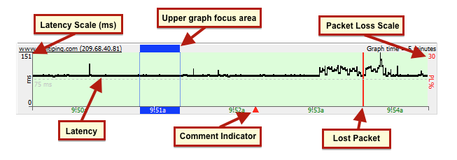
- Latency: The black line on the graph is your target's roundtrip latency for that particular point in time
- Latency scale: Shows the scale of latency over a certain period. This scale can be set to auto adjust itself accordingly, or, you can set it to a pre-defined value
- Lost packets: The red lines in the graph indicate that MultiPing did not receive a response during that particular point in time (can be a percent, based on your time scale).
- Packet loss scale: Shows the scale of packet loss (and is set by default at 30%). This can get a *bit* confusing if you're looking at a small time period (between 60 seconds an hour) - because each sample can be multiple pixels wide (resulting in a solid red line). Only when you zoom out to a bigger timeframe (between 3 to 48 hours) does this become helpful. See our knowledge base article on time graph packet loss height for a more detailed description of how this works.
- Comment indicator: Shows anywhere that a comment has been made on a timeline graph (you can add a comment by right clicking on a graph, and choosing "Create comment").
- Upper graph focus area: Double clicking on an area in a timeline graph will focus the upper graph to that period of time, which is shown by the blue highlighted area. The size of the focus area is dictated by the "Samples to include" setting at the top of MultiPing.
Navigating through the timeline graph is as easy as clicking and dragging it around. You can also use your mouse's scroll wheel to accomplish the same task. You can adjust the amount of time shown by right clicking anywhere inside of a timeline graph and choosing a new timeframe preference (anywhere from 60 seconds to 48 hours). Your mouse's scroll wheel works a bit of magic here, too. If you hold down the "ctrl" key on your keyboard while using the scroll wheel, the graph will expand and contract accordingly - at the point where your mouse cursor is.