Display Options
The "Display" settings control the general display format of MultiPing's graphs, including scaling, coloring, and other general values.
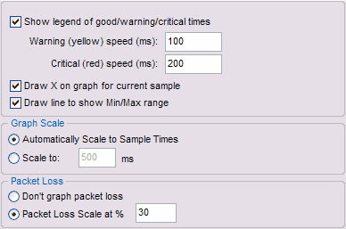
Show legend
The legend is shown above the graphs on MultiPing to indicate the range of latencies used for each color band. This legend is automatically hidden if there isn't enough space for it. Turn off this option to never show the legend. |
|
Warning and Critical speed limits
Changing these values sets the Green / Yellow / Red threshold for the graphs. This is dependant on your expected performance. For a modem, 200 ms might be quite good, while for a T1, it could be considered bad.
Draw X on graph for current sample
When examining current data, sometimes its handy to graph the most recent sample collected. Turn this on to see that.
Draw line to show Min/Max Range
When showing just a few samples, this can be really handy to see the range of latencies. As you increase your window, though, a single bad sample can make this line stretch the scale of the graph.
Graph Scale
Normally, setting the graph scale to automatic works pretty well. Sometimes, you might get a few samples *way* out of range, though, that stretches the scale. This is especially likely as you increase the value for samples to include.
Packet Loss
Most often, graphing the packet loss is a handy, easy way to see lost samples. 30% seems to work great for highlighting just the right of loss in most cases, but you're certainly going to run into cases where you want to change this to something lower (as low as 1) or higher (any number is valid - even over 100).