Navigating the Target Graph
The target graph (or upper graph) in MultiPing breaks down all of the trace information that's been collected from your targets, and displays it in a series of columns. This portion of MultiPing also has some configuration options present, and contains several different parts:
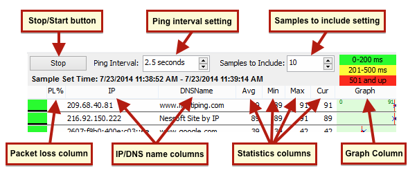
- Stop/Start button: This one is pretty self explanatory: click this button to either start or stop tracing to all targets
- Ping interval setting: Here, you can specify how long you'd like MultiPing to wait between sending its requests. We recommend a setting of 2.5 seconds - as this gives a good amount of accuracy without too much data. You can pick from the list, or enter your own (even sub-second).
- Samples to include setting: All of the statistics in the target graph are based off of this setting. If you have it set to 10 - then MultiPing is looking at the most recent 10 samples, and basing its data off of this. The "samples to include" setting also directly controls the amount of data shown in the focus area of the timeline graph (which we'll cover in the next section). If you think in times instead of numbers (5 minutes?), enter the time you're thinking of and MultiPing will convert that to samples for you, based on the data you're looking at.
- Packet Loss column: This column shows the percentage of lost packets in the current sample set (current sample set = "samples to include" setting)
- IP/DNS name columns: These two columns will display both the IP address, and the best name that MultiPing can determine for your target(s)
- Statistics columns: In these columns, MultiPing will show the statistics for your targets based off of your current sample set. You can configure these columns to show the average latency (Avg), minimum latency (Min), maximum latency (Max) and current sample's latency (Cur)
- Graph column: This column will show a minimum/maximum latency line (unless its hidden), a blue "x" for the most current sample, and a red line to show the average latency to that target. The graph also shows packet loss in the form of a light red bar, which gets longer as the packet loss increases
You do have the option to configure the target graph to show (or not show) certain columns. If you right click anywhere in the target graph and select the option to "customize view" - a you'll be brought to a window where you can select which items you'd like to show/hide.